
Comparison
Table Website
MoneySuperMarket.com is a British FTSE 200 company which runs a price comparison website. The website enables consumers to compare prices on a range of products, including mortgages, credit cards and loans.
The Service
The idea is that you don't need to do anything, your Travel Counsellor handles everything for you, helping you with destination ideas, booking flights, hotels, transfers and then even excursions, tours and events. You simply tell them what kind of holiday you would like and they do the rest.
Results matter
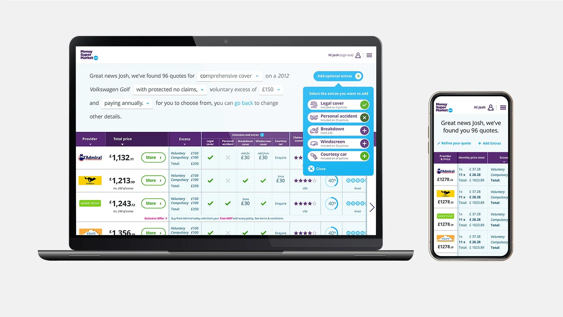
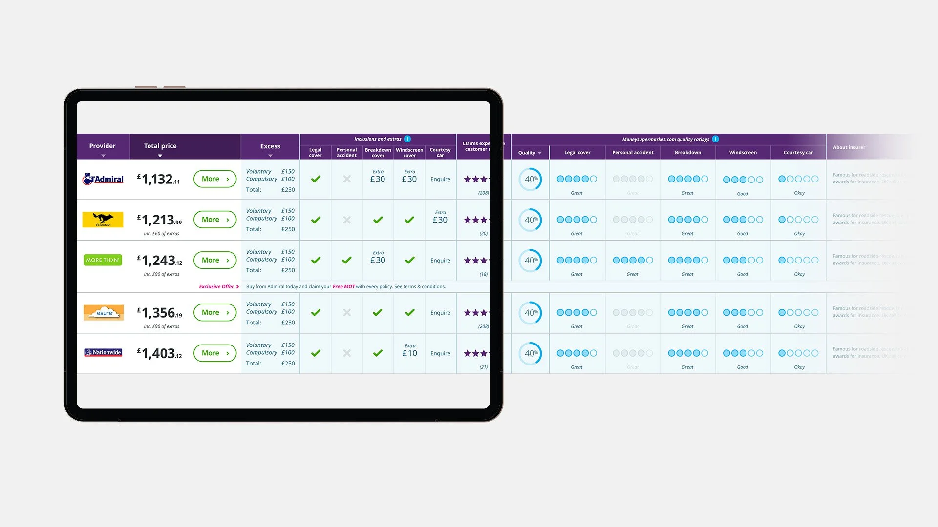
During my time at MoneySuperMarket.com my first project was to address how the results from motor insurance policy searches were displayed. This is MoneySuperMarket.com's most important channel and a few options to the way results were being displayed had already been put into live traffic to see how they performed.
Customer types
Instead of lots of personas we identified two main customer types, customer one: simple and quick, customer two: detailed and thorough. With these two personas in mind we got to work looking at the main reason for the site which was the showing of prices to compare with detail if needed.
Price is key for both personas

PERSONA 1: Keep it SIMPLE. They are busy so look for basic info only. Quick decision.

PERSONA 2: Wants the DETAIL. They are Thorough. Reads into it. Shops around.
Works for everyone and everything
The main requirements was that the table would work well across all devices, this could mean a totally different representation of the information which what had happened in the past but we wanted to not go to far away from learned behaviour of the audience after years of looking at comparison tables.

Traditional tables
With traditional tables on most price comparison sites accepted layout is to position the logo, price and call to action within separate columns and have the user scroll to find them. This meant not all the information was in view.
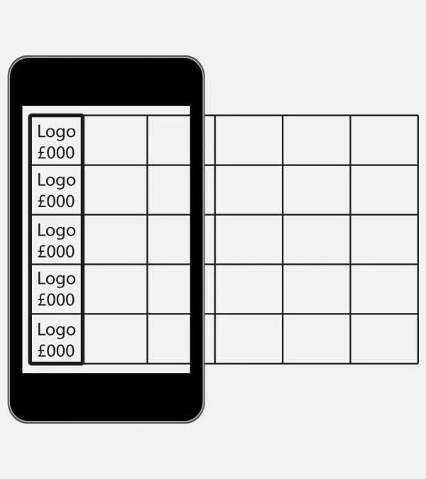
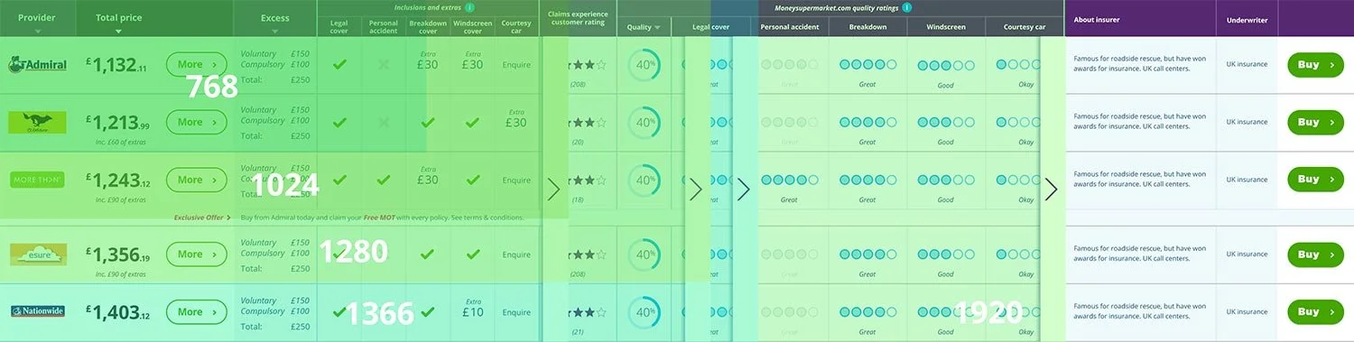
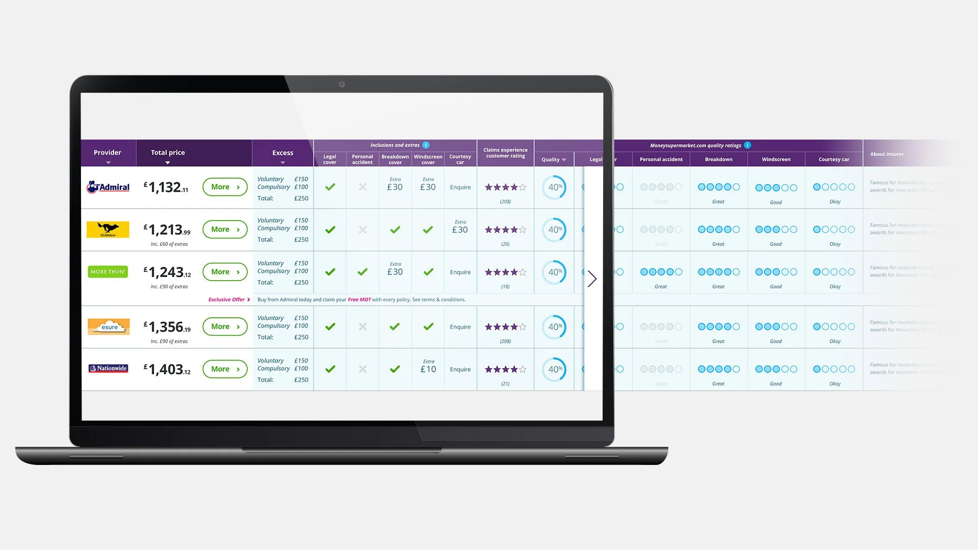
New fixed position table
Our solution was to combine the Logo and price together into one fixed column and making that column a button. This meant that there was enough space to make that column static.
A table for both personas
This solution gave us a table that had the primary information fixed, ideal for the simple and quick persona and scrollable detail which helped the detail persona decide.

Clear on any device
The table also worked for any device size and the fixed position column would respond accordingly, until at mobile it was stacked and without a button. If the customer was using a desktop they would see the functionality to scroll the table, for touch devices this wasn't present.
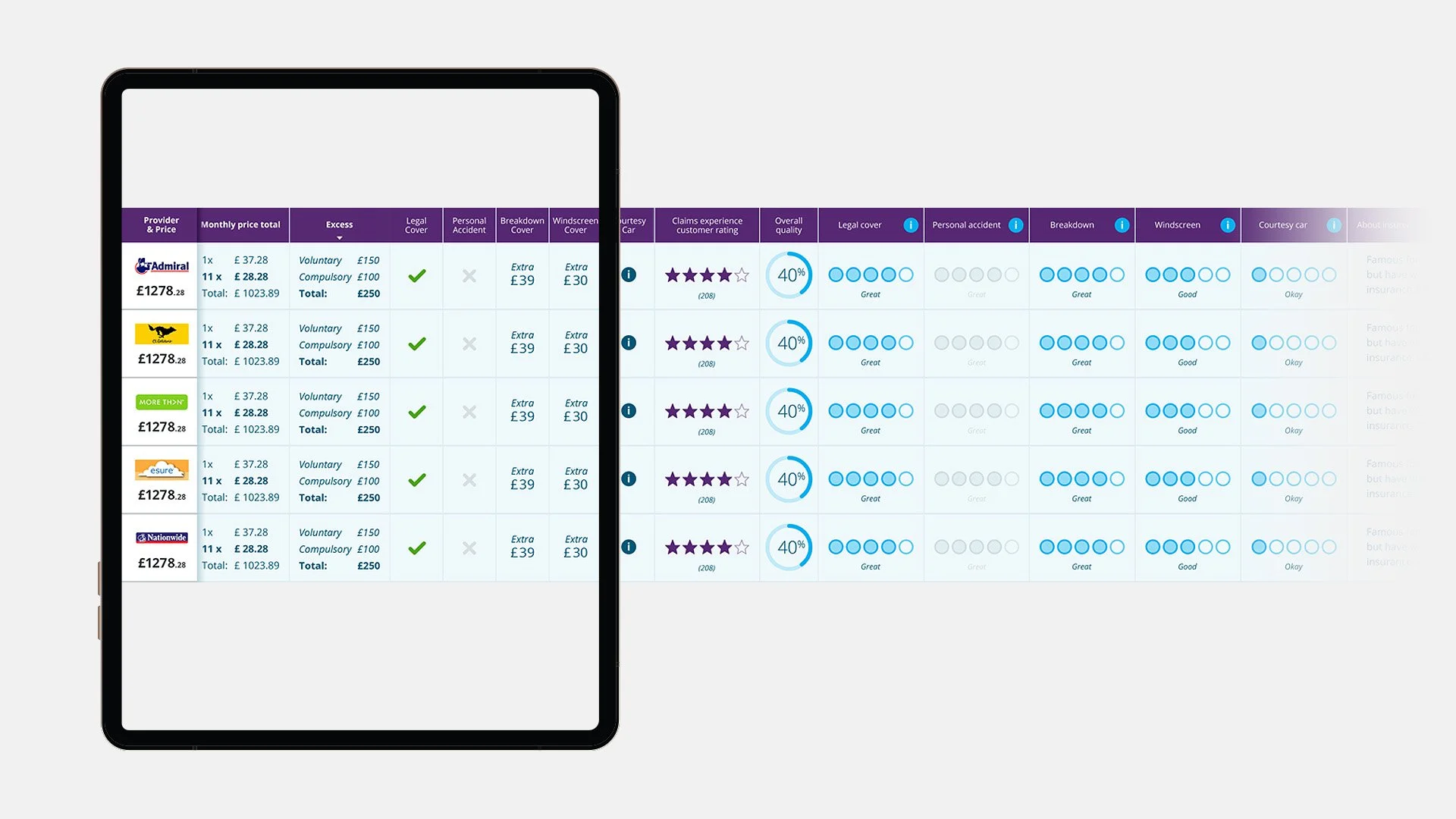


As the screen size got smaller the fixed position table column responded by stacking and then removing the call to action. Testing showed that the user would click on the supplier logo and price to purchase.