

HSBC
Mortgage calculator
HSBC mortgage brokers make around five mortgage affordability calculations per day and they needed a better tool for the job.
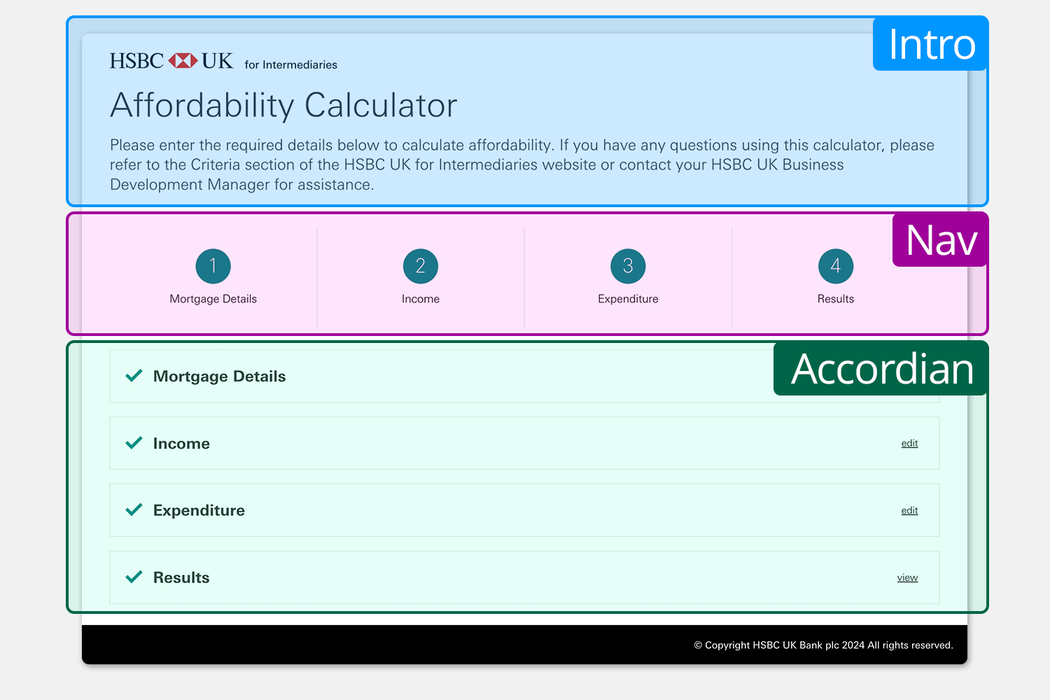
Current calculator
Mortgage affordability calculator is a form located on the website for intermediaries. It’s used by mortgage brokers to see if the customers borrowing can afford their income. The calculator needed re-platforming to avoid 3rd party hosting costs. We wanted to use this as an opportunity to do better and give it a UX update.
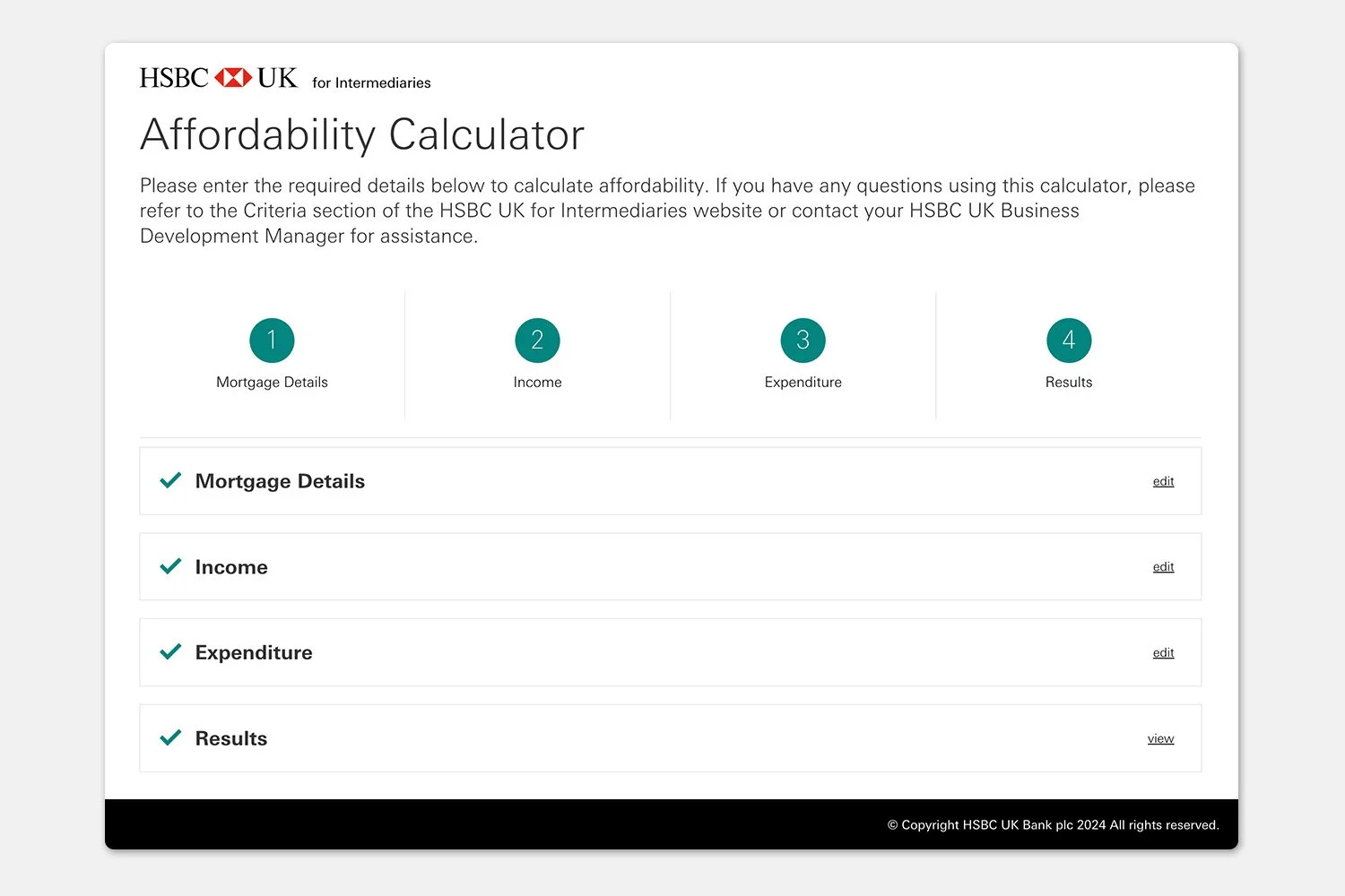
Straightaway my design gut instincts screamed at me that the calculator needed a totally new approach where the overall structure needed addressing. As you can see below there was a lot of screen furniture that I imagine is used just once, not used or get in the way of actual form filling.

Professional form fillers
Understanding that the affordability calculator form is not just a task but a tool for day to day work for the Mortgage Broker. Mortgage calculators can take many different shapes and ask different amounts of information. HSBC want the best calculator for mortgage brokers and looking to reduce interaction, loading and completion times whilst also make our calculator more simple and easier to use.
Options for structure
We came up with 3 options to structure the form and keeping in mind that I felt that we needed to change

Not changing what the brokers are used to.
1. Accordion sections

Use the typical structure for information input heavy forms.
2. Typical stepped forms
3. Single page forms
One long scrolling page.

Winner
“Looking at the three form options,
from your experience,
which do you prefer to work with?”


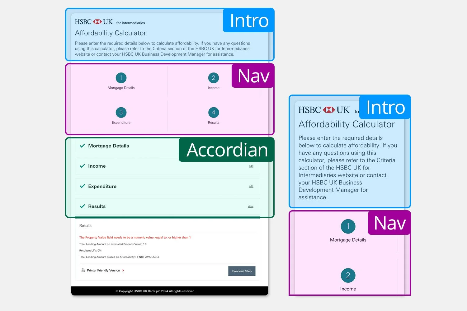
Opening up the pages
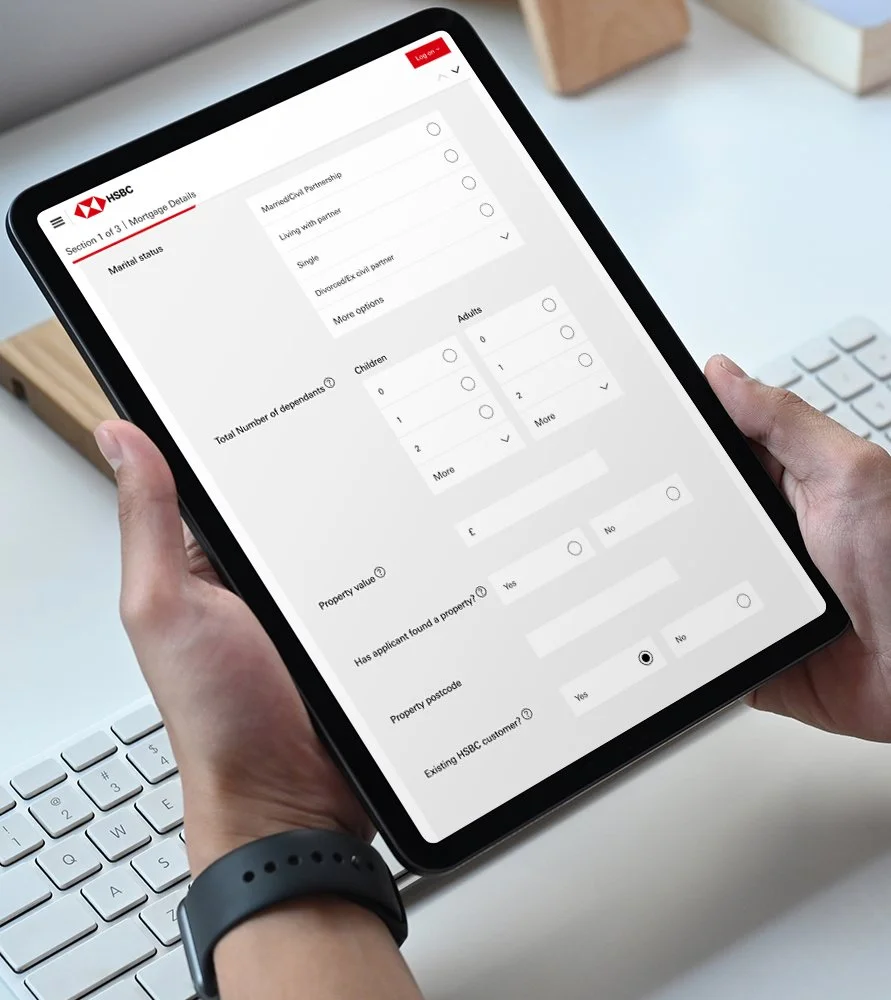
The original calculator had sections in an accordian that opened and closed as they were completed or edited. This meant user orientation was impacted as the screen content moved around especially at smaller screen sizes.
Not only that the form itself was using two columns, this also needed simplifying to avoid busy reading patterns.
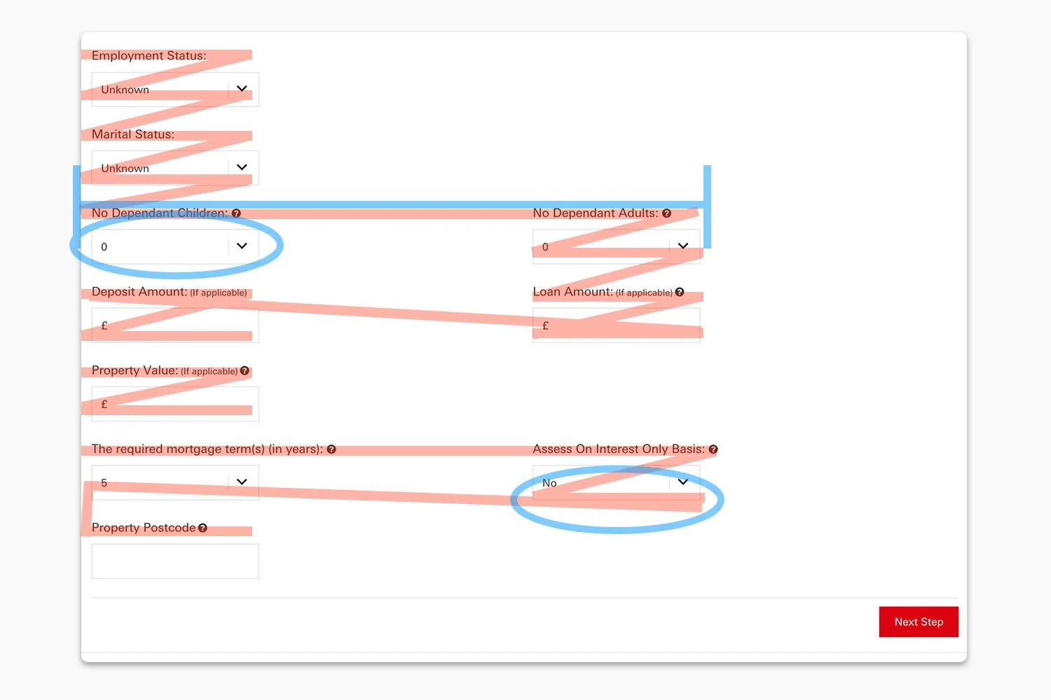

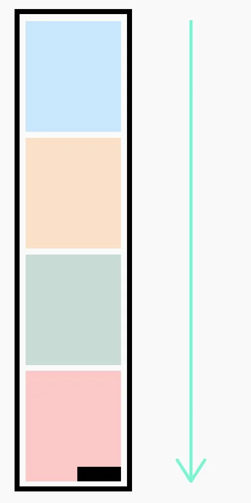
Before/busy
Original form with busy reading pattern across two columns. Reading column width is wide with increased risk of missing content and tracking back and up.
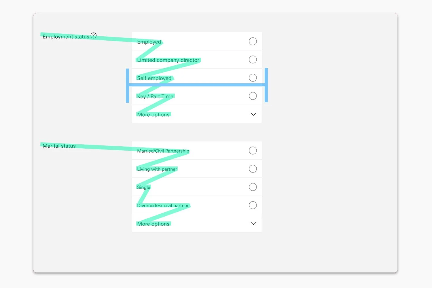
After/calm
New form layout with calmer reading pattern. Bulk of reading content is set between a narrower reading column and needs to be noted this is showing the answers also.
Human behaviour
Designing in the majority for human form filling and because we were dealing with repeat visits we knew it was a tool that needed to be as clean as possible as a flow and experience.
Reducing cognitive load
To help with cognitive load we used some techniques like spacing the form out, putting the screen into a single column, chunking the questions under section headers amongst other good practices.
Progressive disclosure
Where possible progressive disclosure was used. This kept the form as minimal as possible at any one time, keeps the complexity as low as possible which also helped in reducing cognitive load whilst importantly saved time from needless processing of form elements.
Flow state
With a single long page form and opening up the inputs, we hoped to get the user into a totally task focussed flow state, where inputting feels effortless and moving through the form quickly.
Opening up the inputs
So many taps and scrolls and taps and opening of drop downs and taps to input! There were more modern and faster methods to adopt.
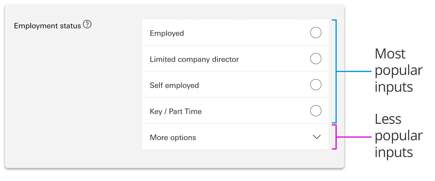
Dropdown vs radio selection
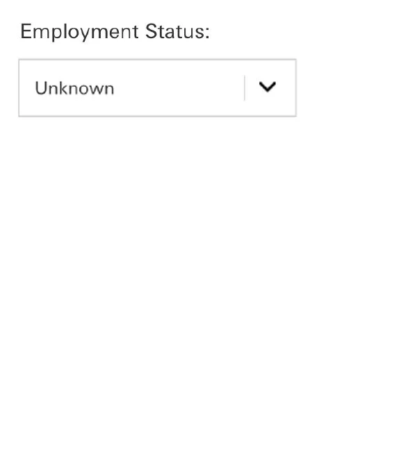
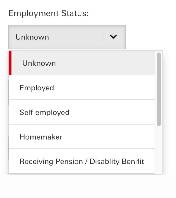
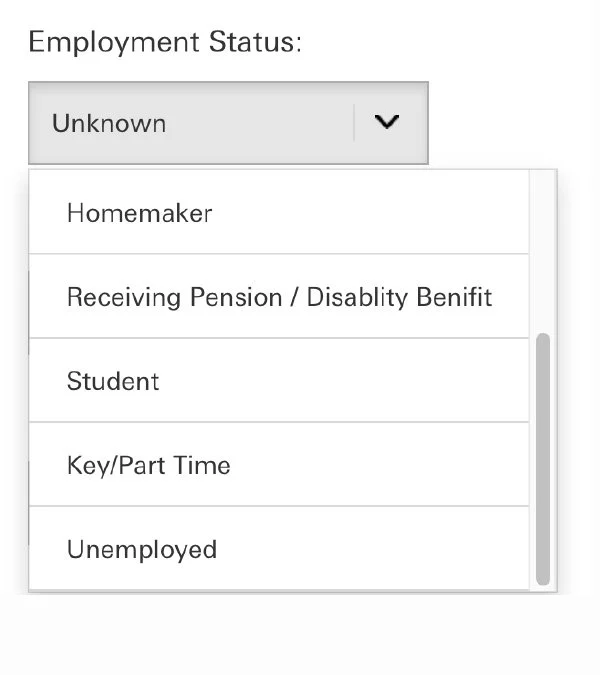
Current use of dropdowns for answers with lots of optional answers means more interaction and cognitive load for the user.


Answers hidden
Popular answers not in order
Lots of interactions to input
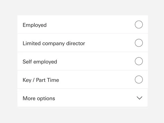


Answers visible
Popular answers shown first
Single interaction input in most cases
Inputs take time and time is money
Original form relied on cramped drop downs to select answers inside scrolling lists. Overall 3 interactions plus reading per input.

Read

Tap
Read

Scroll
Read
Tap
Tap and done
In most cases by opening up the answers using radio button input the user only needs to read and then tap once. This means interactions reduced by up to 66% verses using the old drop down pattern.
Read
Tap
Pre filled (Zero tap and done)
In the instances where values are optional or needed but most popular input is zero, we pre-fill for faster form completion and trust the broker to have the correct figure in place.


Accessibility
We ran the form UX past accessibility experts within the business, there feedback was based around recommendations on how the form should be built (especially with screen reading) and no concerns around the UX of the form inputs which all passed and proved to not be a blocker.
Loooooooong form features
Obviously opening the accordion sections into a loner page and then opening up all the dropdown inputs meant that the form was at the maximum length it could be so this meant tackling more scrolling and making sure the user was orientated.

Navigation
A sticky navigation was created that allows the user to skip entire sections.
Progress bar
Clear marker for where the user was within the form showing progress and section names

Floating results panel
IThe results were the last section but on the return scroll they were displayed in a right side panel so that the user can see the results update as they make amended inputs.
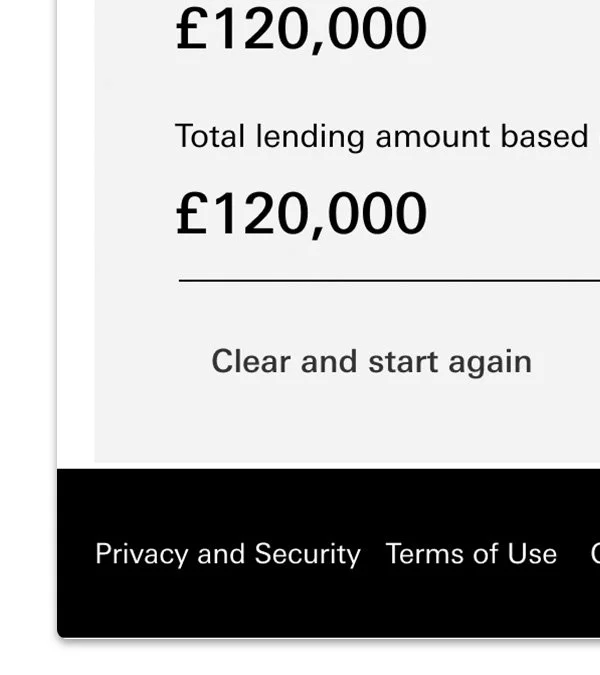
Start again button
Clears all inputs and returns user to the top of the form to start again on a new application.
66%
Interaction reduction
46m
Potential inputs per year
66
Working days saved
Learnings
This project meant going against best practices in some ways for traditional form design as it was a tool for business use. Yet again, its the power of convincing people this is the right solution which became as important as the solution itself. However this project also did suffer with component build and platform timeline issues, so yet to reach its full potential but should do in the next phase of build!