HSBC
Accounts
home
One of the largest banks in the world and the largest in Europe. Like other large banks HSBC is in a moment where they are challenged by smaller digital bank start ups and are looking to modernise their product to compete.
The Project: Accounts home
I was brought into a UX/UI team challenged to redesign the experience on top of the same technical framework. One of these areas to work on was the home page and account details for browser logged on customers.
Sources of research
I jokingly call one of my colleagues Sherlock Holmes, because of his ability to find information and investigate an area of interest to the max. I think this is a great attribute and during this project we tried to take information from a lot of different areas and cross reference it to triangulate which then fed into our design decisions. I find having a more sources of information is way better than just one.

Call centre interviews
New experience principles
Current journey date
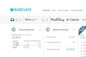
Competitor offering
Customer interviews
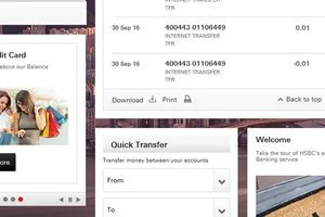
Current framework
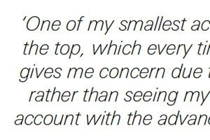
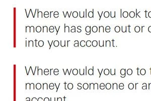
Customer complaints

Workshop
Armed with new found knowledge we replayed the take outs back to ourselves and as a multi role group, got to work, prioritising features, identifying most travelled flows and sketching out visions.
Options to test
We decided to wireframe out 3 of those as separate options ready for customer testing, the idea that we may have a clear winner so we can develop it further.


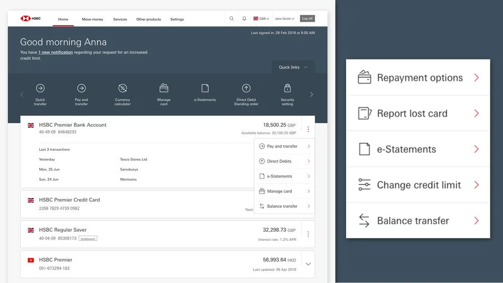
MVP wireframe and viewports
From our options to test it turned out that we didnt have one clear winner, but the list format did come on top, we then combined that with the different winning features to create a really useful banking combination. We also started to think about the accounts details page where a lot of the time the customer would navigate to from the this page.

We confirmed our responsive desktop, tablet and mobile screens, how we would handle the content and prototyped all 3 for testing.

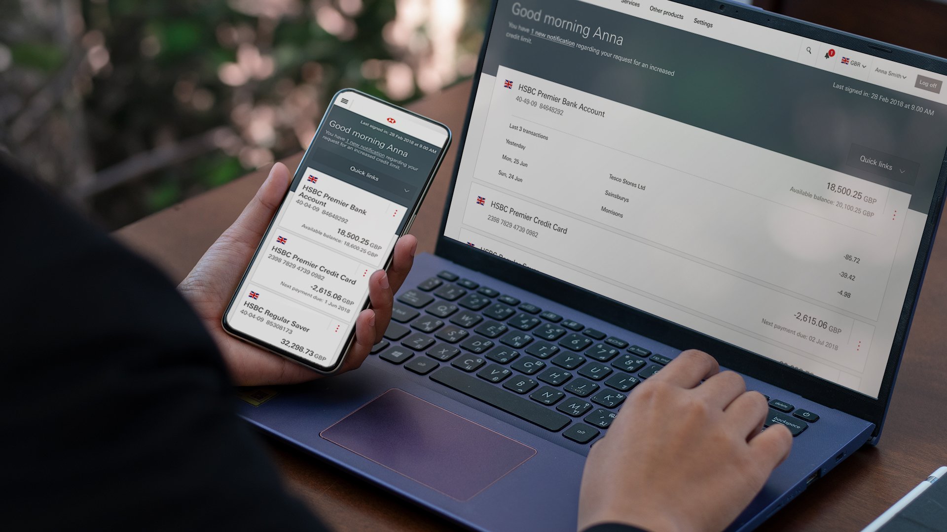
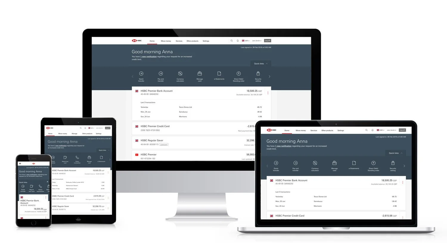
High fidelity
Once we were happy with this wireframe, we took it up a notch and looked at a high fidelity design and also added the accounts details page for further testing.

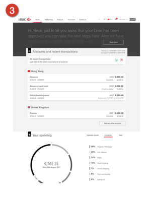
Account details
When the customer taps on an account from the home page they are taken to the account details. Here we needed a screen that would work for any account type and enable the customer to complete tasks on that account. We created new features including reporting suspicious transactions.
Baseline UX & Core build
From the MVP wireframe onwards the Home Page tested well all the way through the project, we then took that baseline minimal product UX into build. This meant working towards having a first draft of a core build. We built in 2 week sprints ironing out issues as we went.
Future thinking
We then set to work on new features working our way out of the minimal viable product into something more rich. We ran customer test cycles every 6 weeks across 3 different countries and multi customer segments to get a good cross reference of feedback. Over time we added features and changed them to suit the country.
Global rollout
From here the home page is being rolled out for customer use around the world. We then worked on what the delta was, this is the difference between the core build and any customisations a particular country may need to meet their banking culture and standards. Feedback has been positive.
62
Countries
40m
Customers
10m+
Visits globally per day
Learnings
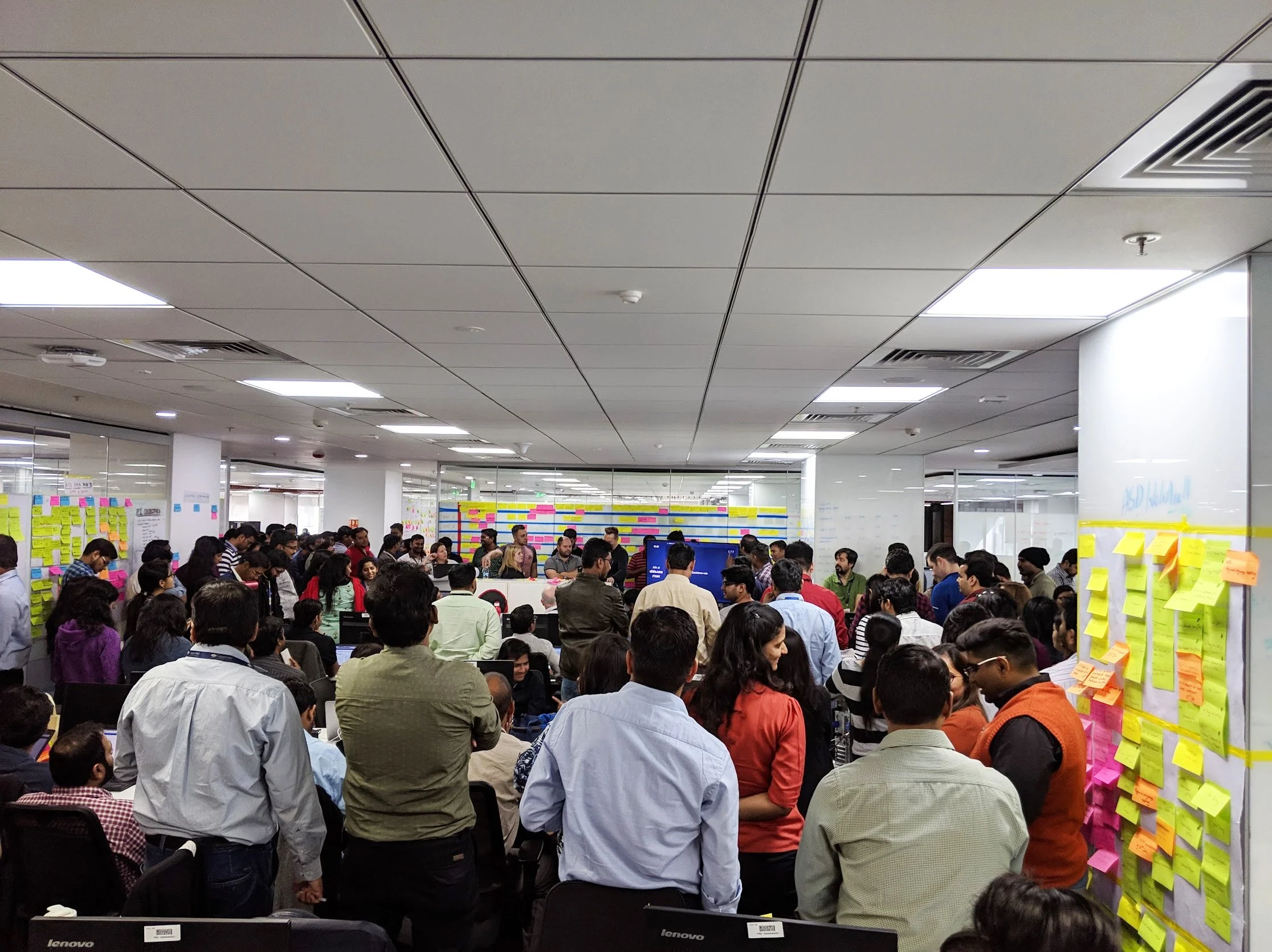
Over a year in the making and also including being the UX representative to travel to India twice for PI Planning with all pods in the build team, the project was the largest I have worked on to that point and the most global in influence. Team working and multi-tasking skills matured with this project and I was working under security clearance.